Tomado
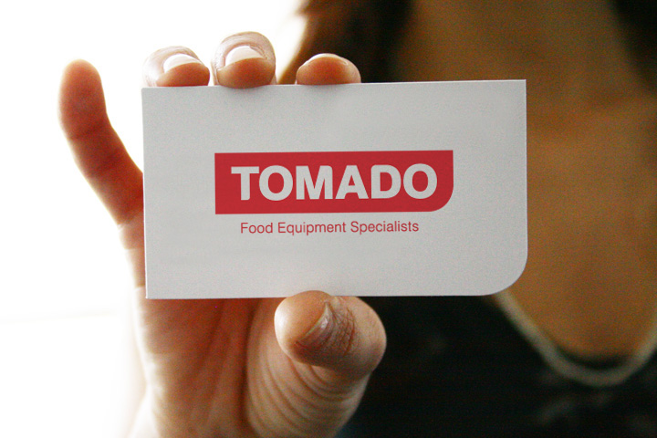
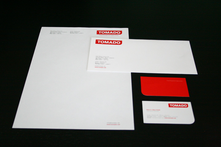
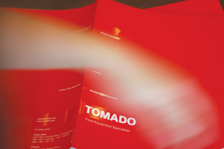
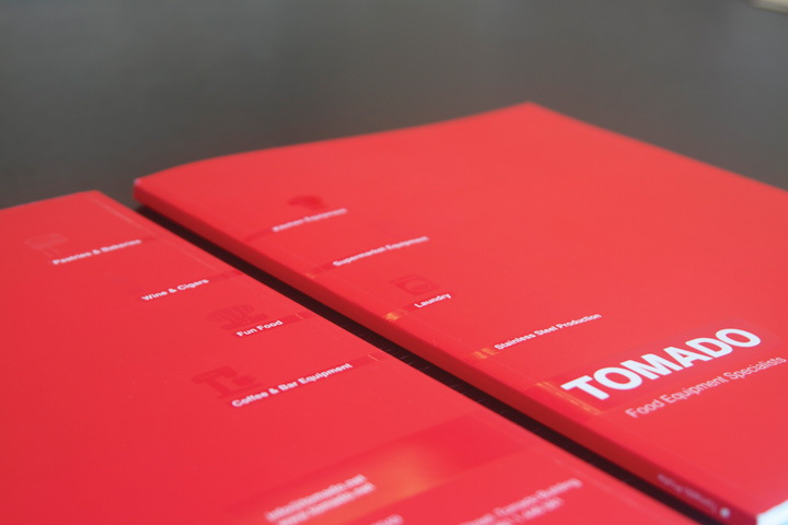
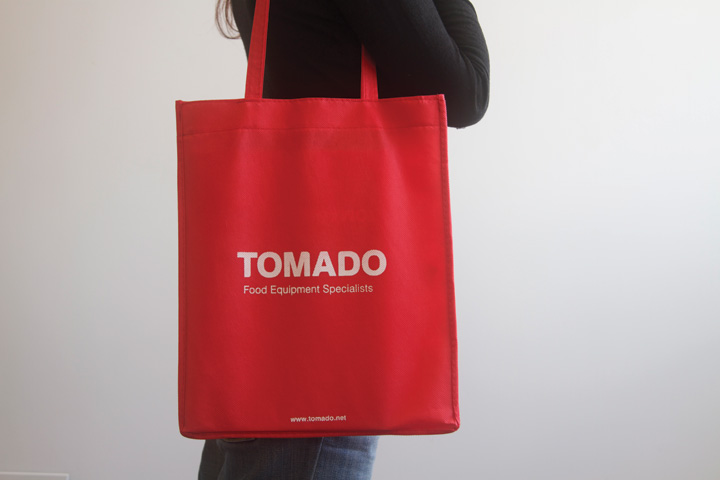
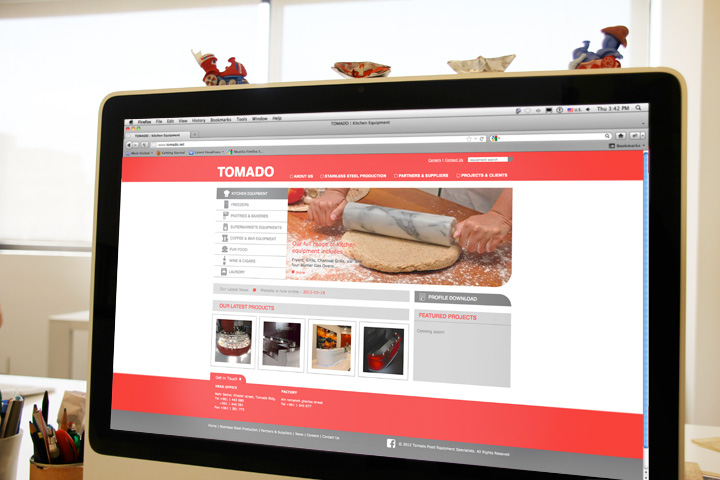
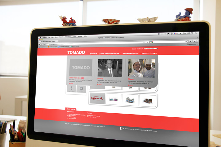
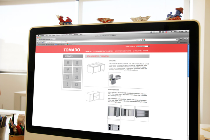
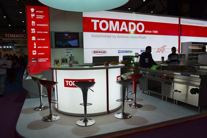
Originally a family business, Tomado approached us to redesign their logo and its applications with a refreshed identity. We gave the brand a more contemporary feel, with the recognizable red color but a more solid marquee: A quarter curved rectangle. The design concept is simple and confident, communicating the established and reliable nature of the company and its products.
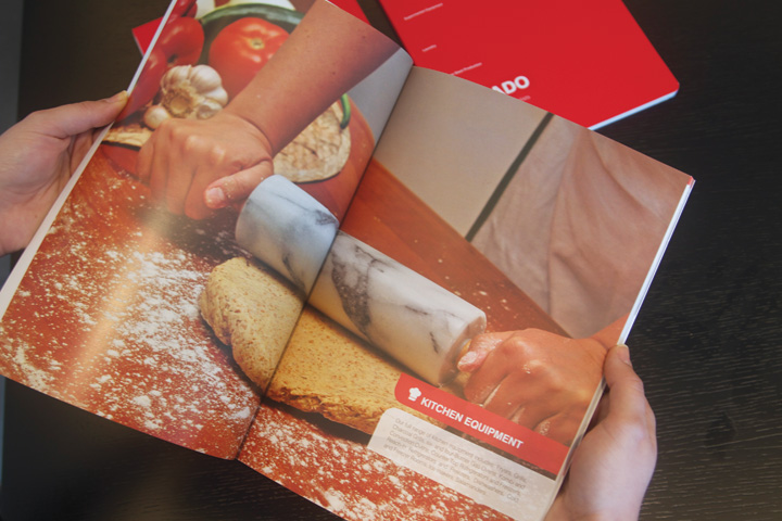
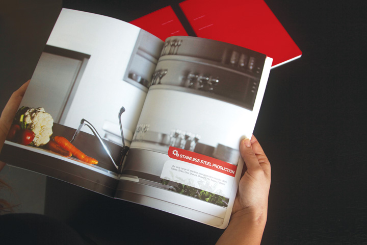
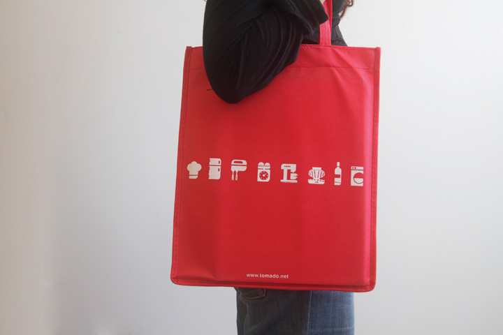
The simplicity is the identity's success. The marquee is used throughout all applications, from signage and bilboards to tiny details such as website icons.
Area: Products & Services